And introducing another member of Hollywood’s ‘Big Five’ - Paramount Pictures! Like its compatriots, Paramount has also produced and distributed a range of iconic films ranging from Transformers (meh), Sonic the Hedgehog (pretty decent) - and… the first six Marvel Cinematic films… weird right? I can imagine Paramount isn’t too pleased with the cash cow that they lost after Marvel formed its own movie studio. Founded in 1912 by William Wadsworth Hodkinson (say that 10x faster) , Adolph Zukor and Jesse L. Lasky, it, alongside Universal, is one of the oldest film studios standing today.
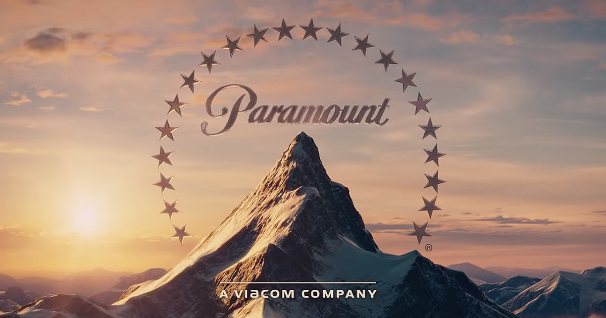
For starters, Paramount has a unique and, somewhat, tranquil logo as the studio’s name rests on top of a mountain peak with twenty-two stars arched over it and in the background, a sunset or sunrise shines over the almost clear clouds and numerous other, albeit smaller, mountains. It is quite mesmerising once you take it all in, its a nice thing to watch before a film starts I’d say.
The typeface matches the calming aesthetic of the overall logo, with the typeface itself displaying an organic or natural style, that being reminiscent of handwriting with smooth looking curves instead of edges. Unlike most typefaces in my previous articles, it is not blocky or boldened further reinstating its freeform nature. The typeface itself bares similarities to the Walt Disney font, as well as the Cursive font family. Another thing to note is that Paramount’s typeface letters seem condensed together, leaving barely any space between them as well as looking italicized.