Owned by Comcast and founded in 1912 by Carl Laemmle, Universal Studios is a film production company that has (probably) produced some of your all-time favourites. As a part of the “Big Five” Universal is one of the most successful film studios out there.
Despite its 100+ years and many, many logo updates its overall feel has remained a constant since its inception.
(1914 - 1919)
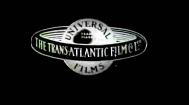
For obvious reasons, I won’t do all of the Universal logos or we’d be here until Christmas (if that’s still happening?). Anyway, the first logo and all the others since show a planet (maybe Earth?) with the company name curving to fit around the globe being displayed. The other words which formed a ring around the ‘globe’ resemble a Saturn-like ring.
(2012 - current)
![]()
The most recent logo bears much of the same feel that the first Universal logo had - now with an image of the Earth and the large, white company name placed in front of the Earth.
Universal Serif
The name of the font used is, un-ironically, named Universal Serif. Although sharing some similarities with the Serif font family and even having Serif in its name, Universal Serif’s letters are bold and thick, almost looking spaced out and the edges of the lettering have sharp-like edges. The typography is also eye catching as it is large and at the forefront, spread across the screen.
In terms of typographic voice, I will have to go with it being digital more than organic as the letters itself look to be streamlined and synthetic, instead of having the organic feel of, in example, cursive. It is a blend between empathetic and tentative, not looking to tentative but too synthetic for empathy. Due to Universal Serif’s perfect, flawless-like design it leans more toward luxury. Finally, I think Universal Serif is rigid because of its, like I said earlier, thick and synthetic look.